
Challenge
Many tasks are complicated and in order to help direct users to the next steps it is necessary to gather additional context.
For example, a user needing a replacement Social Security card might be eligible to do so online. But if their request involves a name change, the answer depends on whether their state of residence shares marriage records with SSA.
Our challenge was to make these complex paths navigable, intuitive, and accessible—while respecting strict data privacy requirements. Complicating matters, the screener collect any PII or pass information to the secure side, meaning the some information had to be re-entered after login.

Questions template
Solution
Our team designed a wizard-like screener experience that asks only what’s necessary—and only when necessary. Built in React and rendered with Drupal via iframe, the screener dynamically branches based on user responses, creating a tailored path through eligibility logic. Each screen includes a single, clear question with concise language, simplified navigation, and accessible UI patterns. A persistent progress indicator offers users a sense of orientation and completion without overwhelming them.
We worked closely with subject matter experts to map out the logic trees behind each screener, ensuring that users would never be asked irrelevant questions. Users can review and edit their answers at the end of the experience before they’re shown their final guidance. This final screen, outlines the user’s recommended next steps—whether it’s booking an in-person appointment, uploading documents online, or bringing specific forms of ID to their local office. We flagged commonly misunderstood requirements, such as unacceptable forms of identification or frequently missing paperwork.
While we couldn't pass data forward into secure workflows, we began experimenting with passing query strings based on the unique pause point through the credentialing flow. This preserved privacy, offered a sense of continuity between secure and public side of ssa.gov, and prevented repetitive questions

Enumerations screener results
Learnings
Screeners highlight one of the central truths of public service UX: flexibility and maintainability matter just as much as usability. Legal and policy changes can affect eligibility criteria overnight. We designed the screener framework to accommodate quick updates—whether that’s changing a follow-up question, tweaking an outcome path, or adding a new branching scenario.
Wireframes and Prototyping
Below are two more screener figma template components and a screenshot of the early Card Replacement screener.

Eligibility screener results

Eligibility ineligible results
Below is a screenshot of an early figma prototype of the card replacement screener
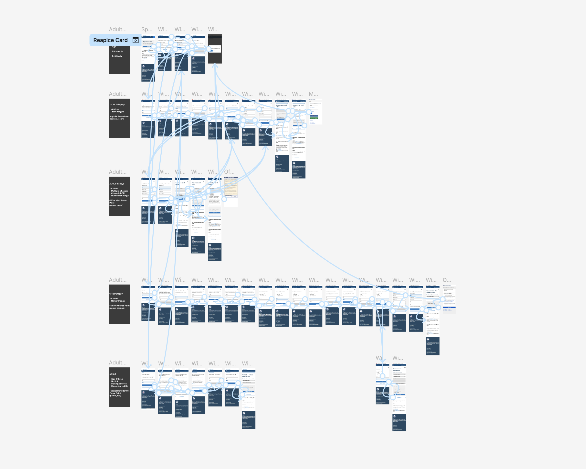
Replace card prototype