Challenge
The web team learned that over a million monthly users were accessing SSA.gov on screens just 320px wide—likely older iPhones or budget Android devices. On these devices, the hamburger menu in the primary navigation was rendered entirely off-screen to the right. This required users to side-scroll to locate the main navigation. However, there were no visual cues to indicate more content was available to the right. This issue wasn't just an oversight, it was an invisible wall preventing many users from navigating the site at all.
Redesigning the header and footer to work at 320px became a top priority. The goal was to fit all core elements: agency branding, top level navigation, an open search bar, a Spanish/English language toggle, and a sign-in button, into a single row at larger screen sizes. At smaller screen sizes the header must contain the agency branding, a Spanish/English language toggle, a sign -n button, and a burger menu button. The navigation must render on browsers down to 320px wide, and ensure that all interactive elements met WCAG AAA’s minimum touch target of 44x44px.
Solution
The solution required multiple design iterations. Early attempts explored stacked layouts in the nav bar which would have allowed for maintaining the primary navigation at smaller screen widths instead of swapping to a burger menu at our tablet breakpoint.
For the language toggle, we explored iconography around language, opting to design custom icons that were language-specific (‘ES’ in a speech bubble, for example) to distinguish between language selection and multilingual resource links.
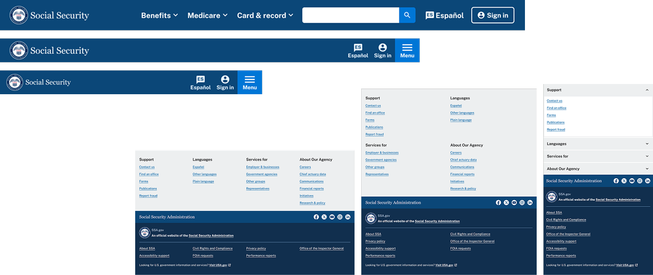
Following best practices from Nielsen Norman Group, we retained an open search input to reduce user confusion. This made it more difficult to fit everything on a single row, but ultimately delivered a better user experience. On the footer, we adhered closely to USWDS structure and styling while incorporating SSA branding. The largest change we made was to bring the agency’s social media links into a separate row. This cleanly separated agency identity and social media links, and allowed us to use a truncated footer in some areas of the website.
Learnings
We learned that moving forward, we had to benchmark all screens and components at a 320px minimum width to make sure that our website was accessible and usable for as many of our visitors as possible.
Every time we designed a new page, component, or interaction design, we made sure to asked ourselves: "will this work down to 320ps?" If it didn't work, we didn't do it, no matter how good it looked on wider screens.
SSA Top level navigation

figma header components

Nav bar at 3 breakpoints
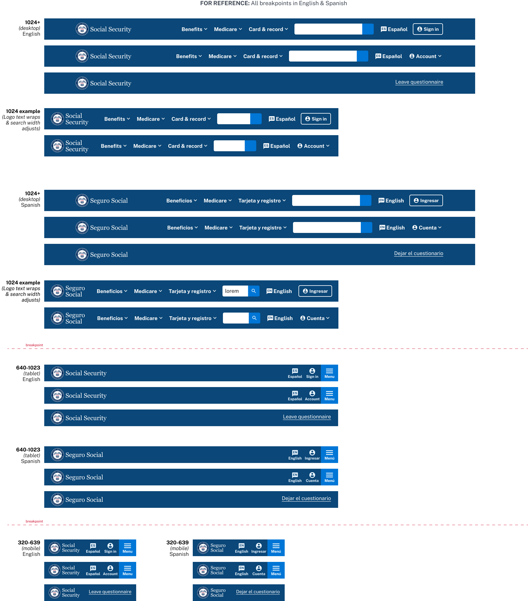
Nav at all breakpoints, english and spanish

ssa nav with dropdowns
SSA Footer
USWDS footer is composed of a “Primary footer” and a “Footer Identifier.” We split off the social media into a separate bar between the two

SSA Footer primary

Footer social bar

SSA Footer identifier