
SSA.gov Field office locator
Scroll ↓
Challenge
The office locator needed to accommodate a wide range of user journeys. Some users start at the office locator looking for a location they can access in-person service. Other users find it mid-process—perhaps after discovering they can’t complete their task online. Still others reach it at the end of their journey, when selecting an office during an appointment scheduling interaction, or looking up directions to the office they are scheduled to visit. Any office locator design had to work in all of these contexts, and provide users clear and immediate access to important office details.
Significant constraints shaped this project. Budget limitations ruled out third-party mapping tools like Google Maps or Mapbox. Internal infrastructure took nearly a year to stand up a usable instance of ArcGIS. Consequently, we had to create a fully functional MVP without a map at all.
Another critical challenge was how to contend with communicating about "Card Service Centers.” A card service center are specialized offices that only handle enumeration-related tasks (like issuing or updating Social Security cards). These centers often confuse users, especially because offices that are near card service centers will not handle enumeration related tasks that are reserved for the local card service center. To compound this issue, even though there are only a handful of card service centers and adjacent non-card service centers nation wide, they are all located in areas that by design have the highest population density. So millions of users will have to navigate deciding between card or non-card service centers. Our design needed to account for this complexity in a way that was both accurate and user-friendly.
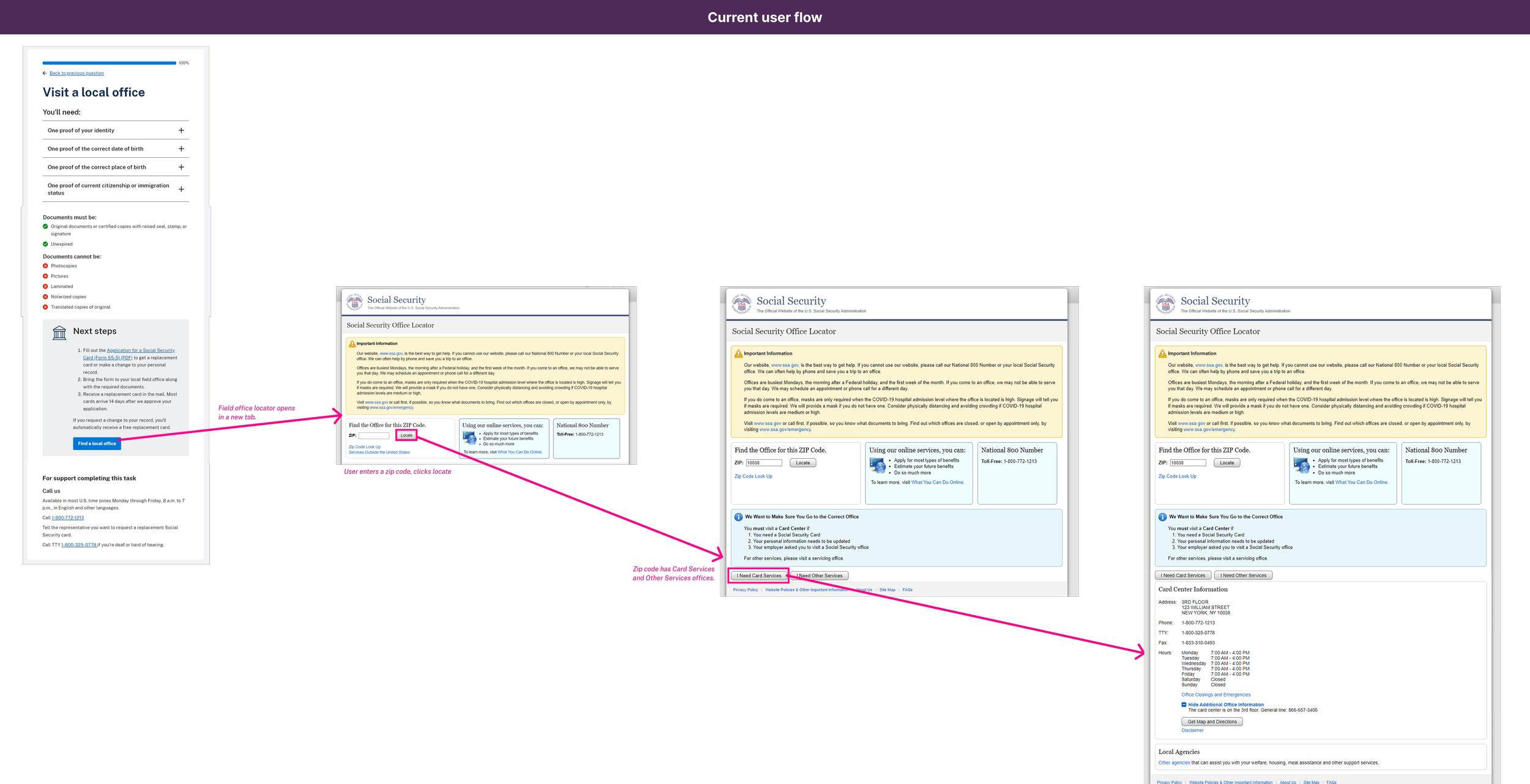
Current state wire flow

Decoupled office locator flow

Early card center wire flow
Solution
We designed a lightweight, responsive interaction centered around a single search interface. The search screen also served as the results page, listing local offices as a vertical stack of distance-sorted cards. Each card displayed basic office info such as distance and hours, a clear visual tag to indicate if Card Service Center (or if it did not handle card services,) and quick access links for directions and detailed office information.
The contextual FAQ was used to help users understand what card service centers were, what they did and what they did not handle, and what it meant when an office did not handle card services.
Clicking through to an office detail page provided additional guidance: address, hours, contact info, specific office alerts, and a short, plain-language explanation about card-related services where applicable. Users could also launch the “Schedule Appointment” flow directly from the detail page. This interaction included a brief questionaire to determine the task type, allowing offices to match appointments with appropriate resources and service capacity.
While the MVP did not include a map-based UI, we designed the locator architecture to accommodate a future integration with ArcGIS. This will eventually allow users to switch between spatial and list-based search methods.

Final MVP Social Security Association Field Office Locator
Learnings
Even without the visual convenience of a map, we learned that clear information architecture, mobile-first design, and precise task guidance can deliver a solid user experience. By structuring office info into modular cards and using visual tags for office types, we mitigated confusion and helped users move confidently through a critical step in their interaction with SSA.
Designing around the complexity of Card Centers taught us the value of contextual guidance. We couldn't eliminate complexity—but we could acknowledge it, explain it, and help users make the right decisions before they ever set foot in a field office. This approach was intended to prevent misdirected visits and reduced strain on staff, and improve outcomes for everyone involved.
Wireframes and Prototyping
Below is an example of a large data table that I needed to preserve in a responsive web format. All of the images on this page are from wireframes I built using Cushman & Wakefield’s current website as a starting point. The full width view entirely re-creates a current webpage, and the tablet and mobile views are entirely my design. They were built to carry through design language and UI while maintaining a seamless responsive experience.

Early proposed wire flow

Early wireframes

user flow self service from google

MVP Wireflow
Below are larger views of the wireframes in order of breakpoint: desktop to tablet to mobile

Office detail re-skin

Self service to office visit flow

Wire flow options
Below are the final designs for the MVP Social Security Field Office Locator redesign. A subsequent iteration would leverage an interactive map as a form of search in addition to the results list.

Field office locator landing page

Field office locator search results

Field office locator office detail page