Challenge
When our team joined the SSA.gov redesign, we inherited a beta site built by the US Digital Service, and a mandate to use the U.S. Web Design System (USWDS) as the design foundation. However, the beta site had no standardized visual hierarchy, inconsistent use of color, and a cluttered typographic system. SSA also maintained an internal-facing design system—UEF (User Experience Framework) We were asked to use USWDS as our base, preserve the visual structure of the beta site to reduce dev rework, and incorporate UEF styles where possible.
This meant designing a coherent system that respected three overlapping and occasionally contradictory sets of guidelines. On top of this, we had to create a Figma component library that worked not just for designers, but also for content strategists and stakeholders who were unfamiliar with design software.
Solution
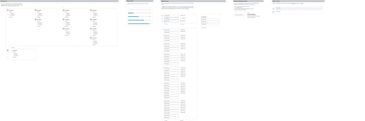
I led the development of an extensible component library in Figma, using an atomic design approach. We started by formalizing the USWDS color palette and typographic hierarchy, baking spacing, color, and hierarchy directly into components. This allowed for drag-and-drop wysiwyg editing as any combination of components could be dropped into flexible templates that would responsively adapt to our breakpoints.
To smooth the design to development transition we aligned component naming conventions in Figma with class names already present in the Drupal templates, where appropriate. When Figma introduced variables mid-project, I led the effort to incorporate variable tokens into our updated component system. With no resources available for how to use and incorporate variables into a design library we reverse engineered the new functionality from product demonstrations recorded at Config 2023, and applied them to our use case.
Learnings
A design system is more than just a valuable technical asset — it’s a living negotiation between the needs of the product, the workflows of the team and the realities of development. Our system worked because it was flexible, understandable, and deeply grounded in the everyday work of building pages inside a real, evolving CMS.
And importantly we learned the benefits of applying ux/user research principles to our own team. As you build internal tools make sure to do your due diligence as UX designers to validate that the tool is the right tool for the team, and it continues to adapt to their needs and workflows. Good UX design principles work at every level.
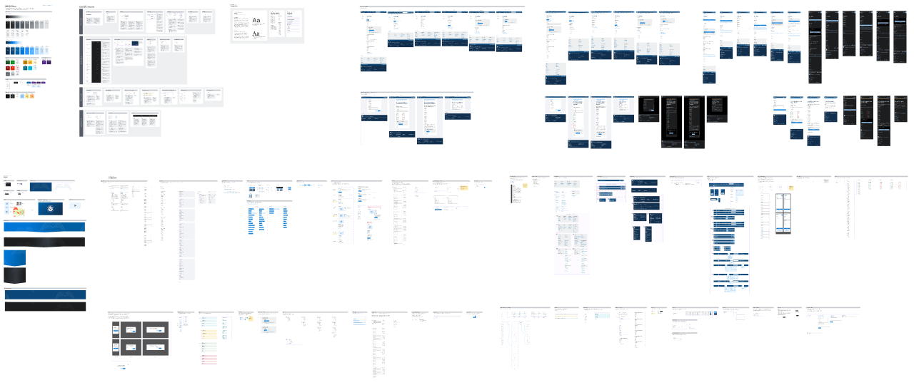
Color palette, typographical system, image assets
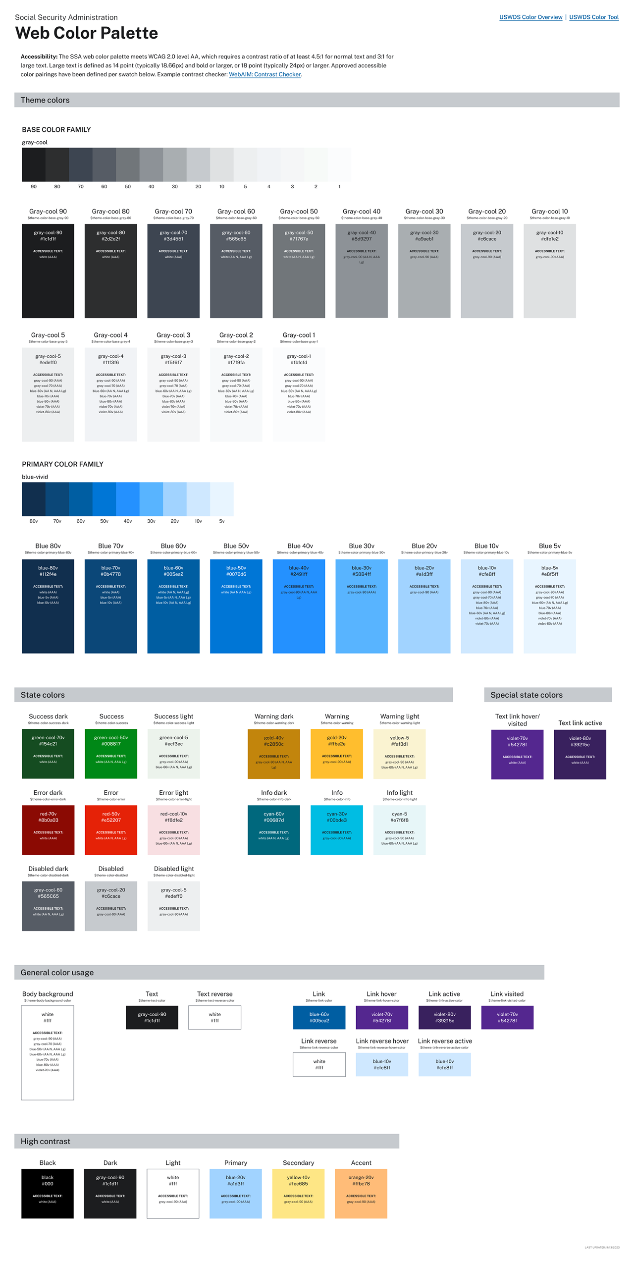
ssa.gov color palette

ssa design system image assets

ssa.gov typographical system
Figma components

ssa components 1

ssa components 2
ssa components 3

ssa components 4

ssa components 5

ssa components 6

ssa components 7

ssa components 8
Drupal and react figma templates

drupal templates

drupal templates high contrast

react templates

react templates high contrast