
Challenge
The core challenge was twofold: integrate the blog into the SSA.gov ecosystem—visually and functionally—while preserving and improving its role as a critical communications tool. Unlike much of the website, the blog serves both institutional and public-facing goals. It is a space for timely updates, policy clarifications, and campaign messaging, shaped by internal priorities and external pressures alike.
The blog also had to meet highly specific requirements: enable sorting by topical campaigns, support content in Spanish, and maintain a moderated comment system while discouraging users from posting personally identifiable information (PII). This all had to be achieved within the limitations of the new CMS, using a component-based page structure consistent with the broader SSA.gov redesign.

Blog updates: blog landing page, blog post page, and blog archives
Solution
We began by analyzing comparable federal and non-government blogs to identify best practices in structure, filtering, and accessibility. We paired that with a deconstruction of SSA’s existing blog content and workflows to determine what could be preserved, streamlined, or improved. Working closely with the communications team, we conducted stakeholder interviews and feedback sessions that revealed deeper strategic models behind their editorial work—including their “bite, snack, meal” framework that connects social media to blog content to in-depth service pages.
The new blog design uses a card-based listing page with a lightweight category filter. Each card includes a title, author, published and updated date (timeliness indicator,) topic tag, and image thumbnail. Individual blog posts were structured for clarity and scanability, featuring a title, author metadata, hero image, timeliness indicator, rich media support, and an author card that is anchor-linked from the byline. Comments are moderated and surfaced under a disclaimer, with SSA responses visually distinguished by branded staff profiles.
To support future growth, we included considerations for a Spanish-language blog toggle and scoped interactions for enhanced filtering by author or tag—features deferred for post-MVP rollout. All design decisions were vetted against SSA’s accessibility standards and built for modular implementation using our design system.
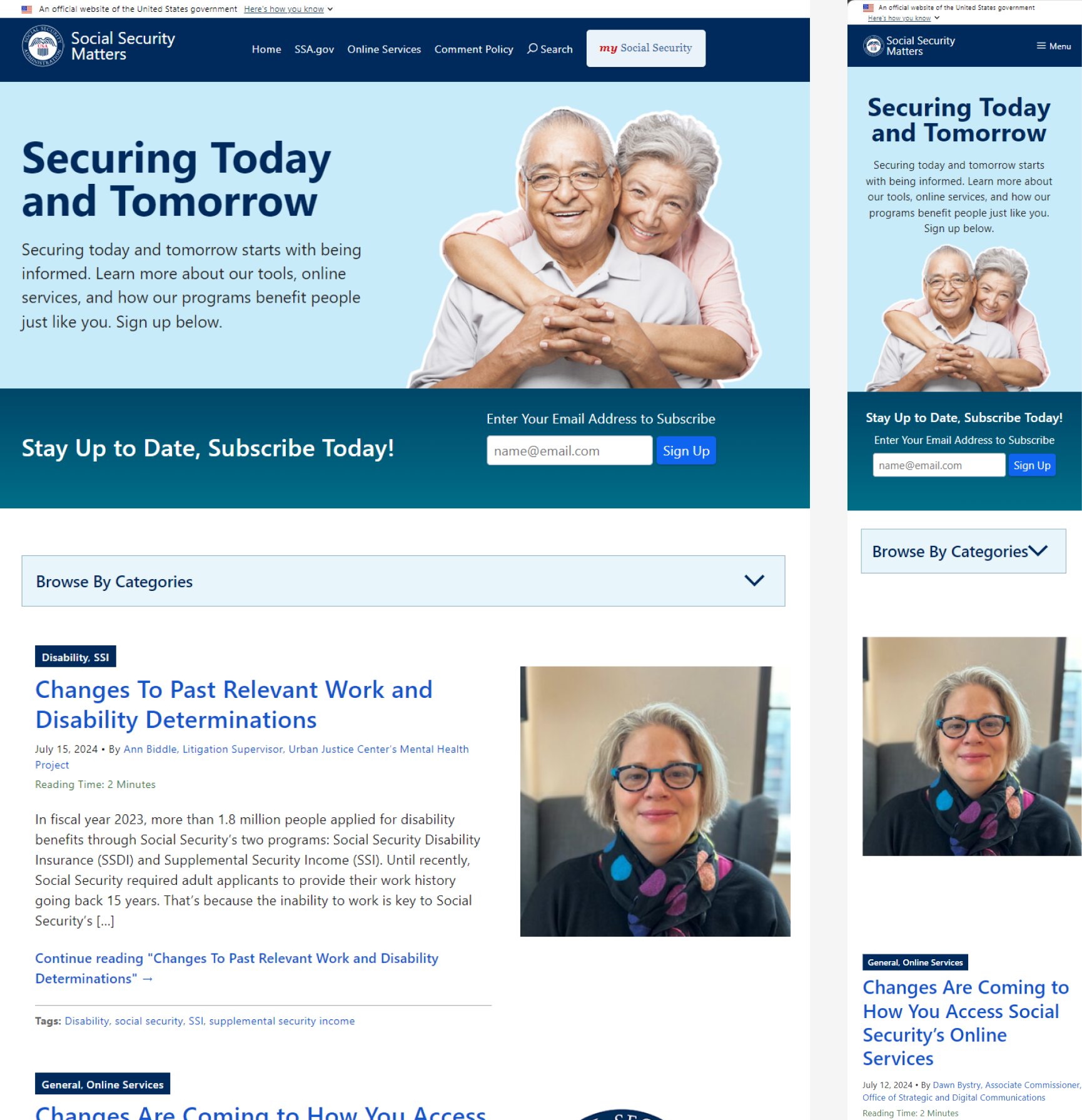
Current blog landing page
Proposed blog landing page
Learnings
This project was an example of designing for dual stakeholders. The design team had to balance the sometimes conflicting needs internal teams with operational demands, and the general public with usability expectations. We learned that aligning CMS limitations with editorial needs requires not just interface design, but deep empathy for team workflows. Especially in high-volume, high-stakes communication settings.
It also reinforced the value of structuring interfaces around narrative and strategy, not just layout. By designing with the “bite, snack, meal” model in mind, we helped ensure the blog supports a coherent public engagement pipeline. In a future phase, expanding filtering functionality and embedding analytics feedback loops will enhance the effectiveness of the communications team.
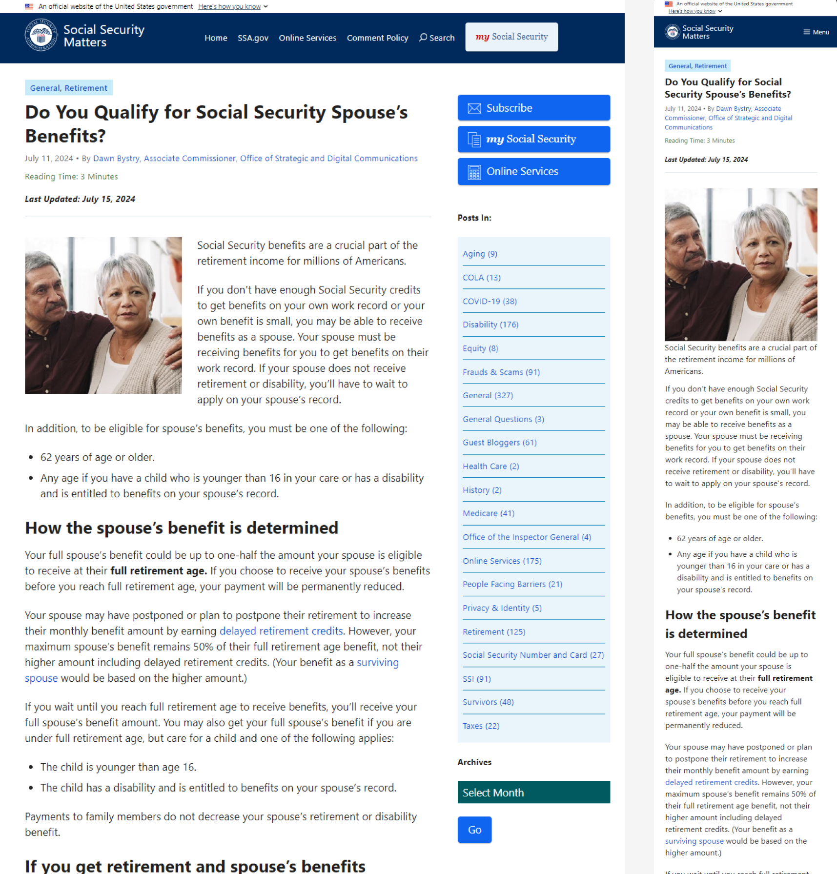
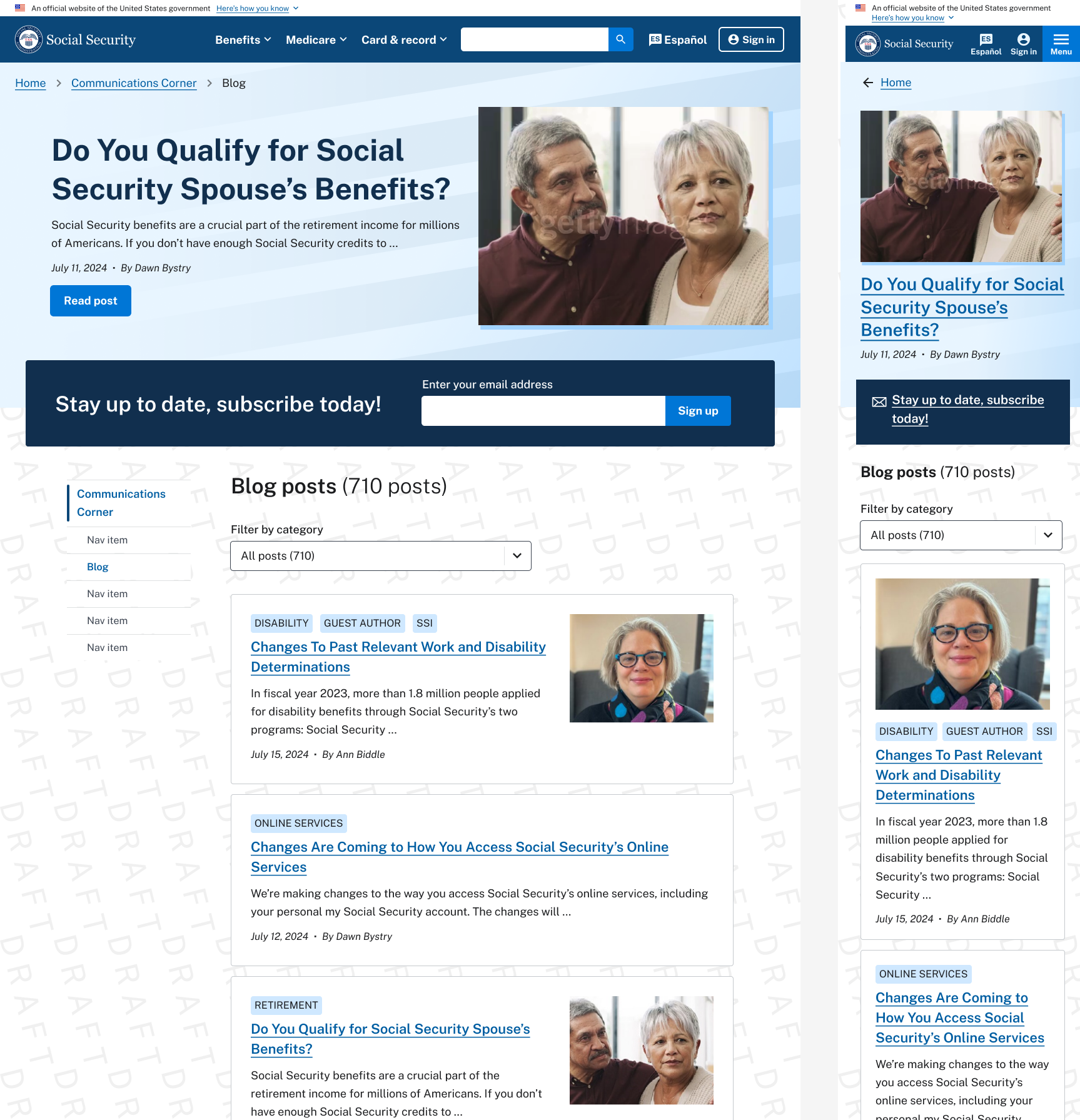
Current blog post

Proposed blog post
The design process
Below is a site map of the Communications Corner (https://www.ssa.gov/news), including the Press Office page—for press releases (https://www.ssa.gov/news/press,) the monthly Newsletter (https://www.ssa.gov/news/newsletter/,) the Blog (https://blog.ssa.gov/,) and other areas such as the complete SSA Policy documentation—POMS (https://secure.ssa.gov/apps10/poms.nsf/Home?readform,) the Advocates page which has “Dear Colleague” letters (https://www.ssa.gov/news/advocates/,) and a link to Research and Statistics published by the Social Security Administration (https://www.ssa.gov/policy/.) There is a lot going on in the Communications Corner as well as some underlying IA issues with URL structure and naming conventions.

Communications Corner sitemap
Below is a wire flow of the blog as it currently is, covering all of it’s functionality (including comments, author searches, and the date and tag filters.

current blog wireflow
Below is some of the “market research” the design team did to benchmark blog design and functionality both in the public and private sector.

A collection of market research
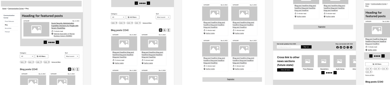
Initial wireframes
These are the initial wireframes we put together to elicit feedback from the communications team. Although the web team was tasked with refreshing the blog and bringing it on to the CMS, actual meetings with the communication team were few and far between. This made it difficult to integrate them in the design process. At the time the web design team was concerned that could lead to a mis-match where expectations of what the communications team wants from the blog, as well as and user needs—core functionality the communications team needs from the blog—might not match the best guesses in our deliverables.

All wireframes
Communications Corner
For the blog refresh the web design team initially included a proposed refresh of the Communications Corner landing page. This was to contextualize the blog refresh within the larger SSA.gov site architecture as well as to receive feedback about the navigational elements included in the blog. Currently the blog is fully stand-alone, despite only being accessible through the Communications Corner: not only does it have a unique URL but it also has no secondary navigation.

Full Communications Corner wireframe
Blog landing page
For our initial designs around the blog landing page we included a faceted search, where users can search by Category, Tag, Author and Date. Results are listed by default from newest to oldest but can be sorted by oldest to newest as well.
We also included three spacing modes: Comfortable (with cards in portrait,) regular (with cards in landscape,) and narrow (where results are given in essentially a table or vertical list.)
Development constraints meant we could not include a faceted search and had to narrow our scope down to only the Category filter. Instead of sorting by date we would move deprecated blogs to a proposed Blog Archive that stored a historical record of blogs SSA has published but removed blogs with content referencing old policies from circulation and web search results.
Full blog landing page wireframe
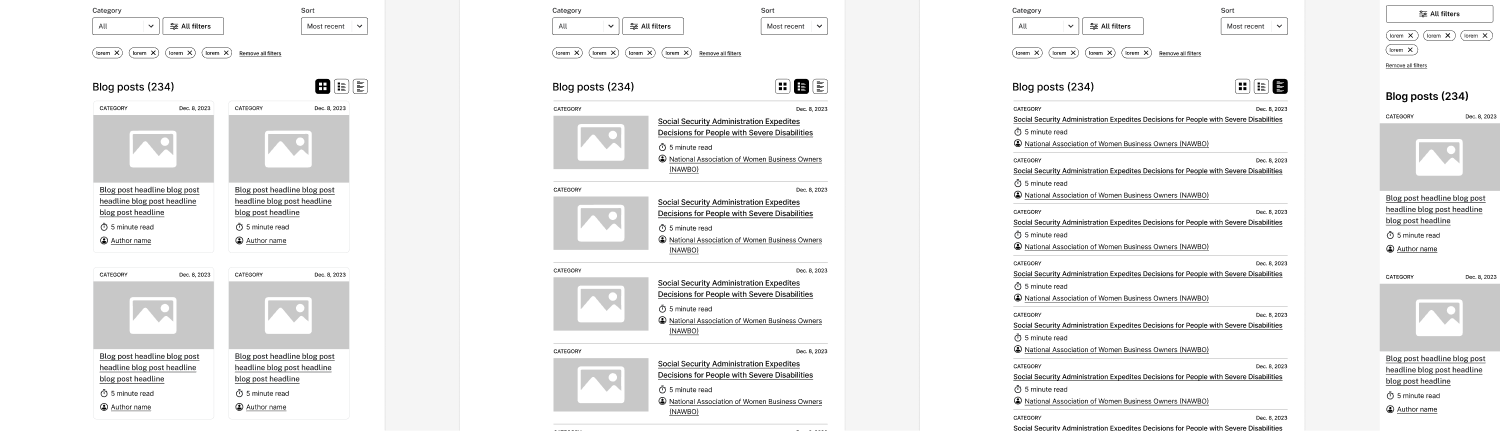
Blog landing page spacing modes
Blog post page
The initial blog post wireframe was structured similarly to content pages on the rest of the CMS where the secondary navigation was placed into a left rail. We included a ‘Key Takeaways’ summary section to promote scanning. Author name at the top was anchor linked to the Author card at the bottom of the page. We included a read length time estimate, which was later removed based on feedback from the communications team that all blog posts were designed to be read in around 2-3 minutes.
The design team worked with 18F to use a standard timeliness indicator that was in the process of being formalized for the US Web Design System. (A timeliness indicator gives a timestamp for publish and the most recent update on any given blog post.)
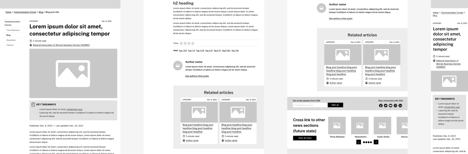
Initial blog post wireframe
Final wireframes
The final blog landing page had a single filter to sort by blog category. On desktop and tablet, blogs were listed in landscape cards with a 4:3 crop of the main blog image to the right of the card content. There is a left rail secondary navigation that would allow users to navigate around the communications corner.
Topic tags were removed from the blog landing page and the blog posts as it was not possible to filter blogs by both Category and Tag on the blog landing page.
The final blog post page had the main blog image as a 16:9 crop at the top of the blog post. Other media in the blog post are also given 16:9 crops. The Key Insights section was maintained. Comments were added as they were deemed important to the work of the communications team.

Blog landing update
Blog post update
We did not move past initial wireframes for the Communications Corner landing page as it was out of scope for the blog refresh. Initial wireframes were only developed to contextualize the work for the blog and anticipate future projects.
Functionality to search blogs by year and month was removed and replaced by the Blog Archives.

Proposed Communications Corner update

Proposed blog archives
Proposed blog landing page
Proposed blog post
The blog archives would contain de-listed blogs that serve as a record of what SSA has published publicly, but might contain outdated information due to policy changes and therefore shouldn’t be maintained as current. Archived blogs would contain a disclaimer at the top of the blog post about outdated information or policy updates.

Proposed blog archives
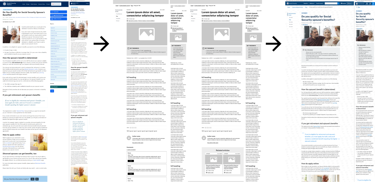
Current to wireframes to final proposed update for the blog landing page (below) and the blog post page below that.
Blog landing update

Blog post update
Full wireframes of the proposed blog landing page and the proposed blog update page.

Blog landing update- full view

Blog post update- full view